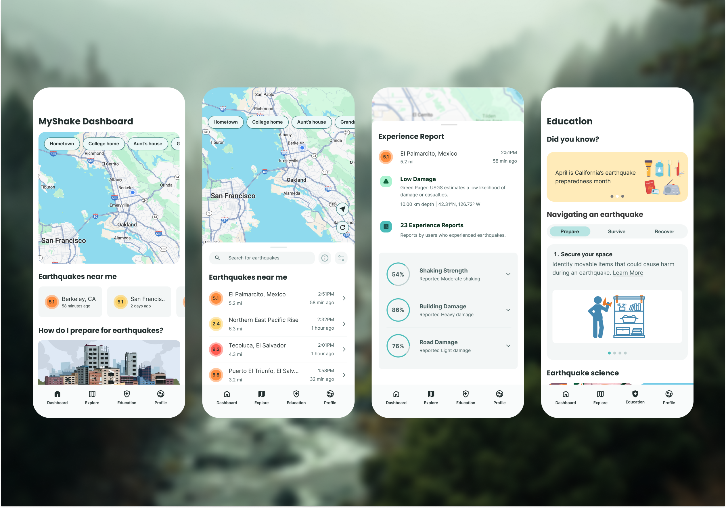
Redesigning MyShake to increase weekly active users through smarter flow and personalized alerts.
Product Design
User Research
Prototyping
Client
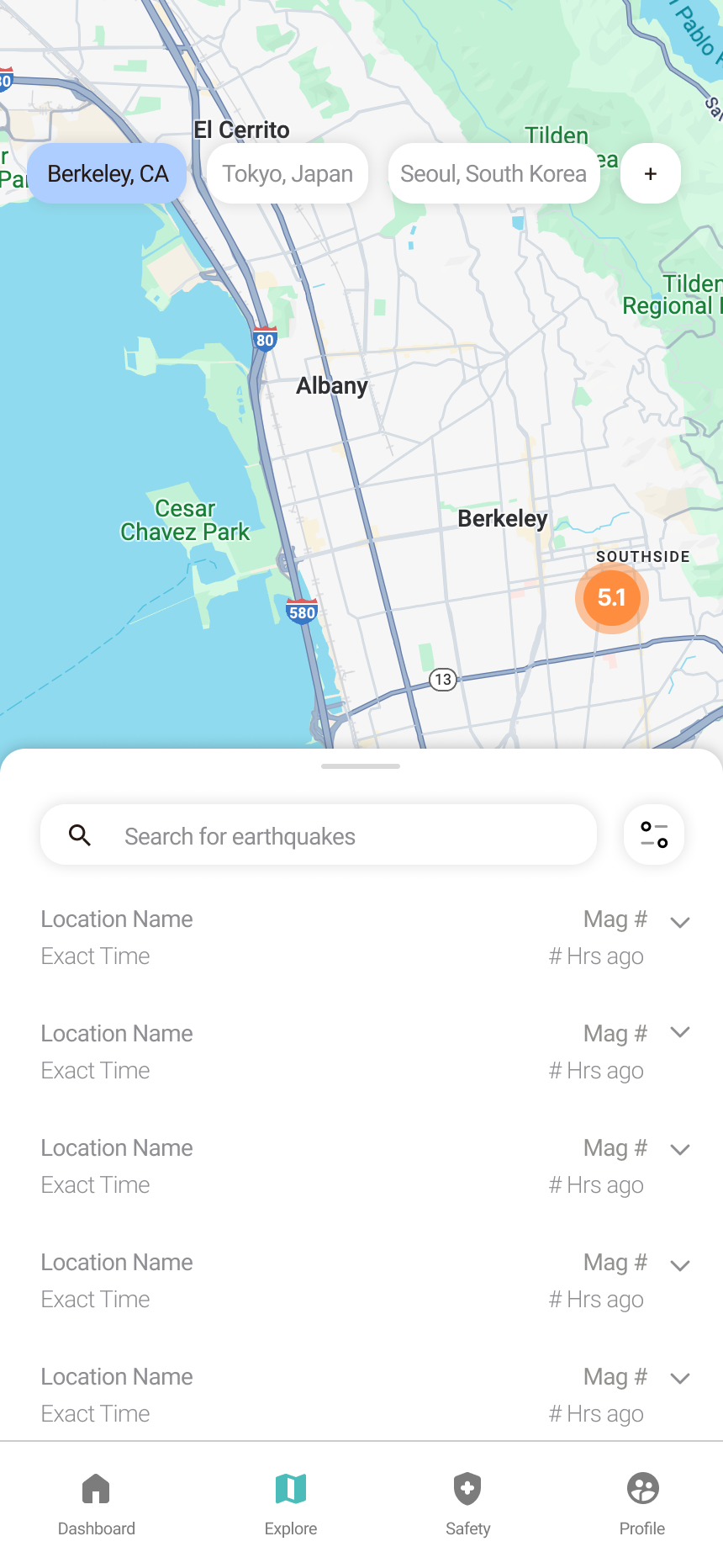
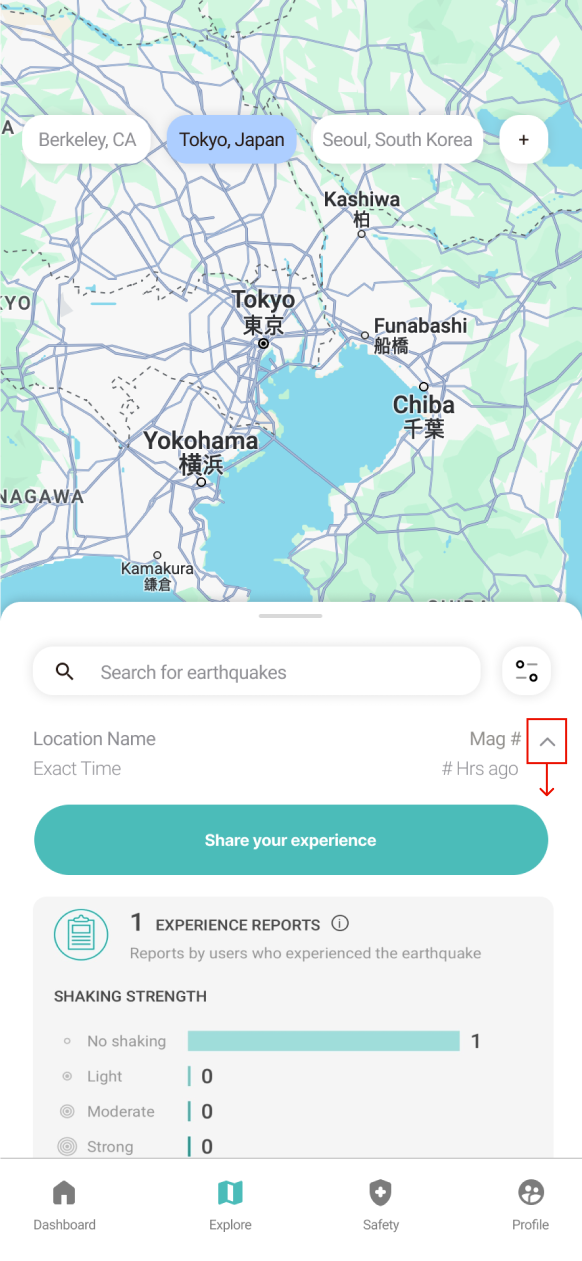
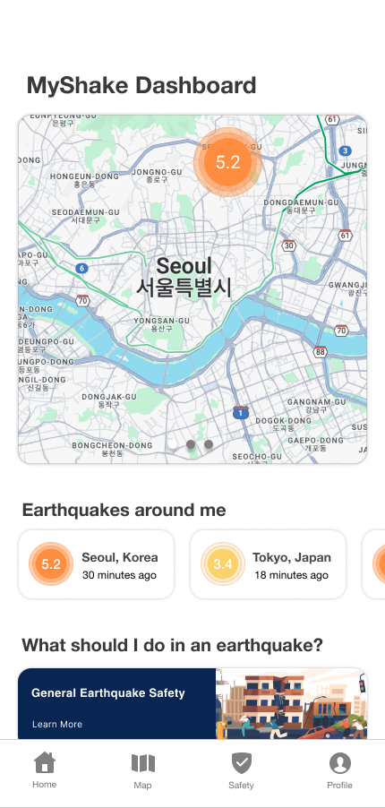
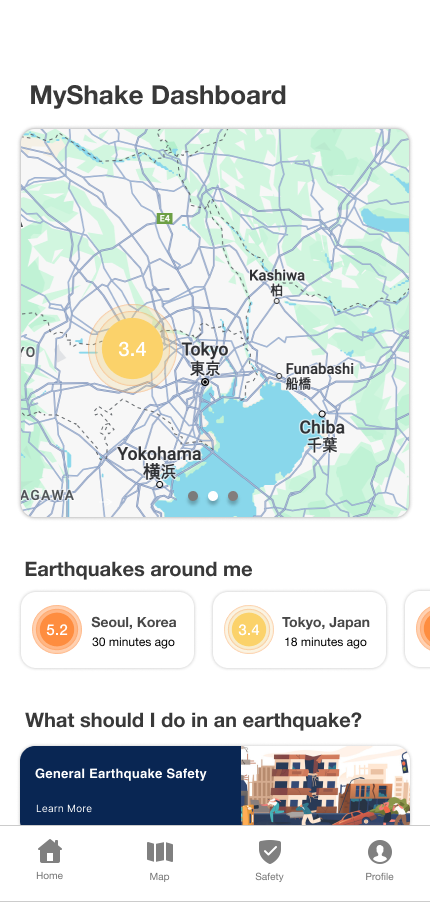
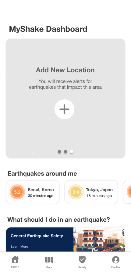
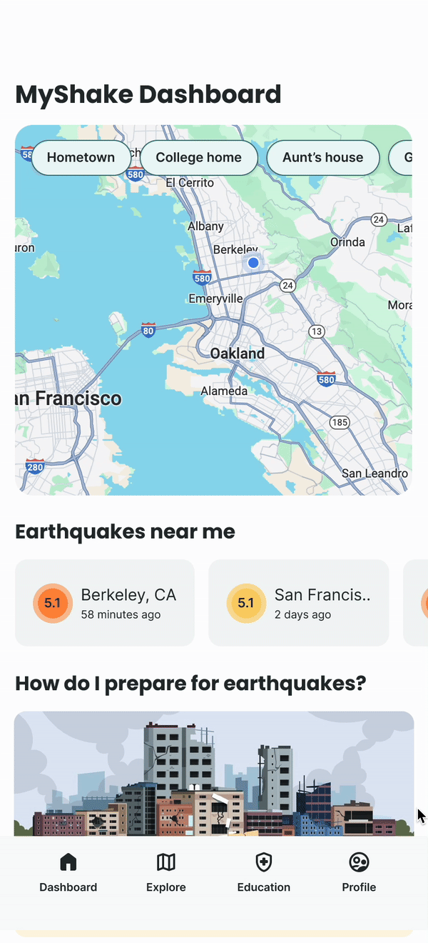
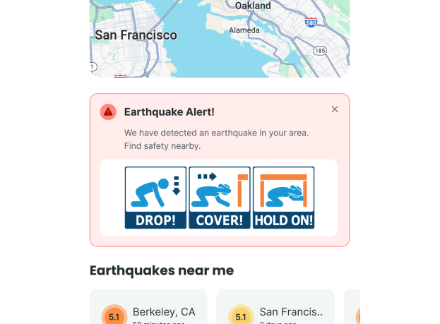
MyShake is an earthquake app with 3.8+ million users, made by Berkeley Seismological Lab, USGS, and Cal OES.
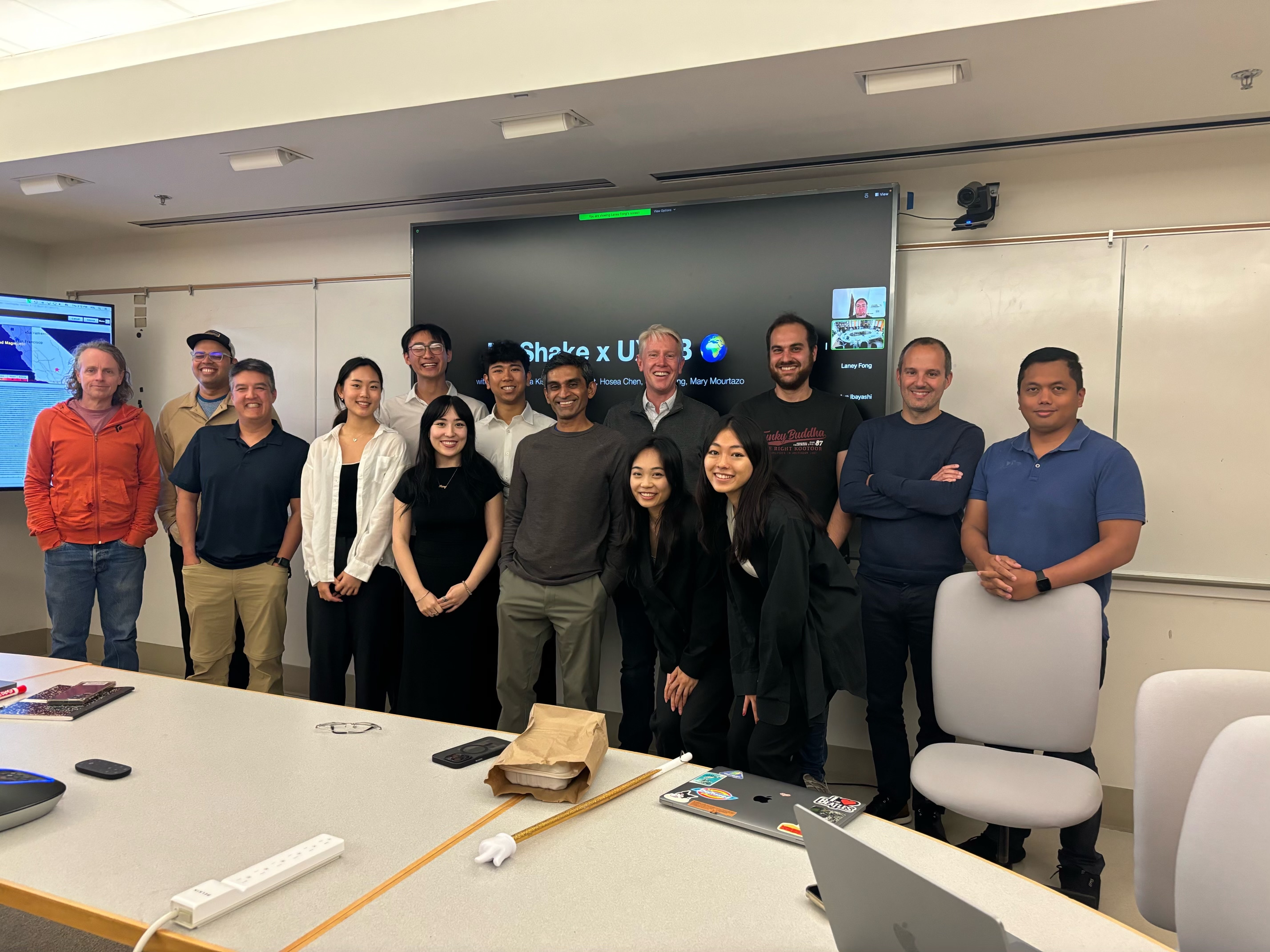
Team
5 Designers
1 Project Manager
1 Developer
1 Project Manager
1 Developer
Skills
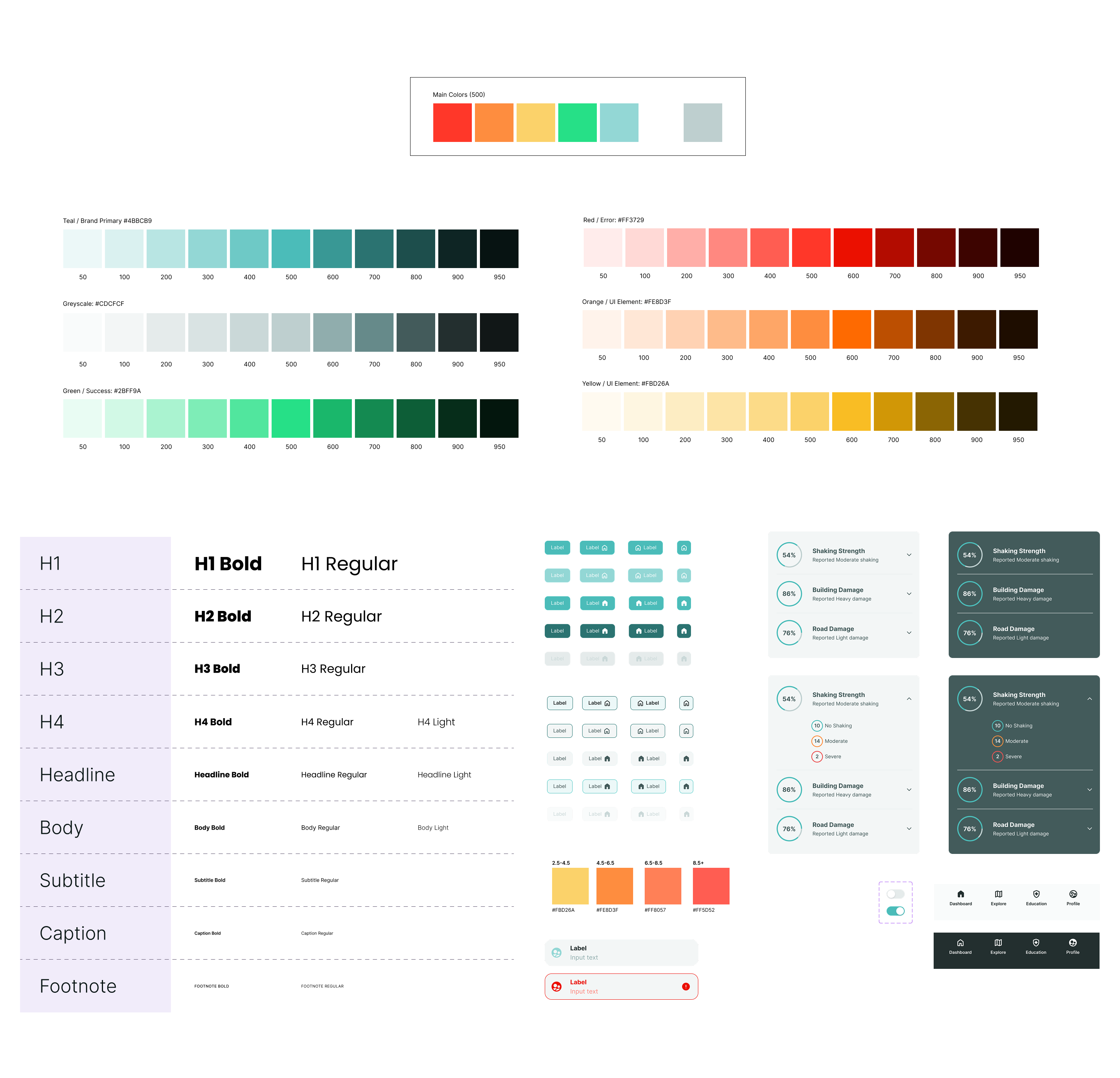
UX Design & Research, Visual Design, Design system, Product Strategy, Figjam, Figma, Google docs
Impact
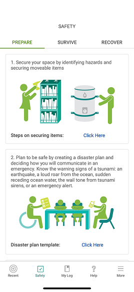
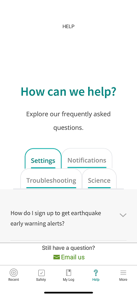
35% increase in weekly active users • 60% reduction in alert confusion (CEN vs. EEW), conducted user interviews and market research, created new modernized design system, restructured IA
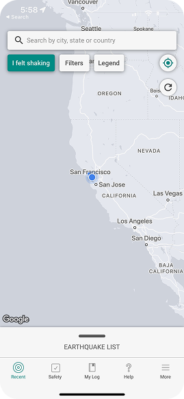
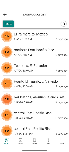
![[interface] screenshot of core features (for a b2b saas)](https://cdn.prod.website-files.com/684b8686903f201509c669f3/6893dbeca15bbd48ce81b371_competingapps-myshake.svg)
![<subject>[interface] image of a screenshot of a learning module (for a edtech business)</subject>](https://cdn.prod.website-files.com/684b8686903f201509c669f3/6855ed268932fe70581901b7_Screenshot%202025-06-20%20at%204.18.02%E2%80%AFPM.png)
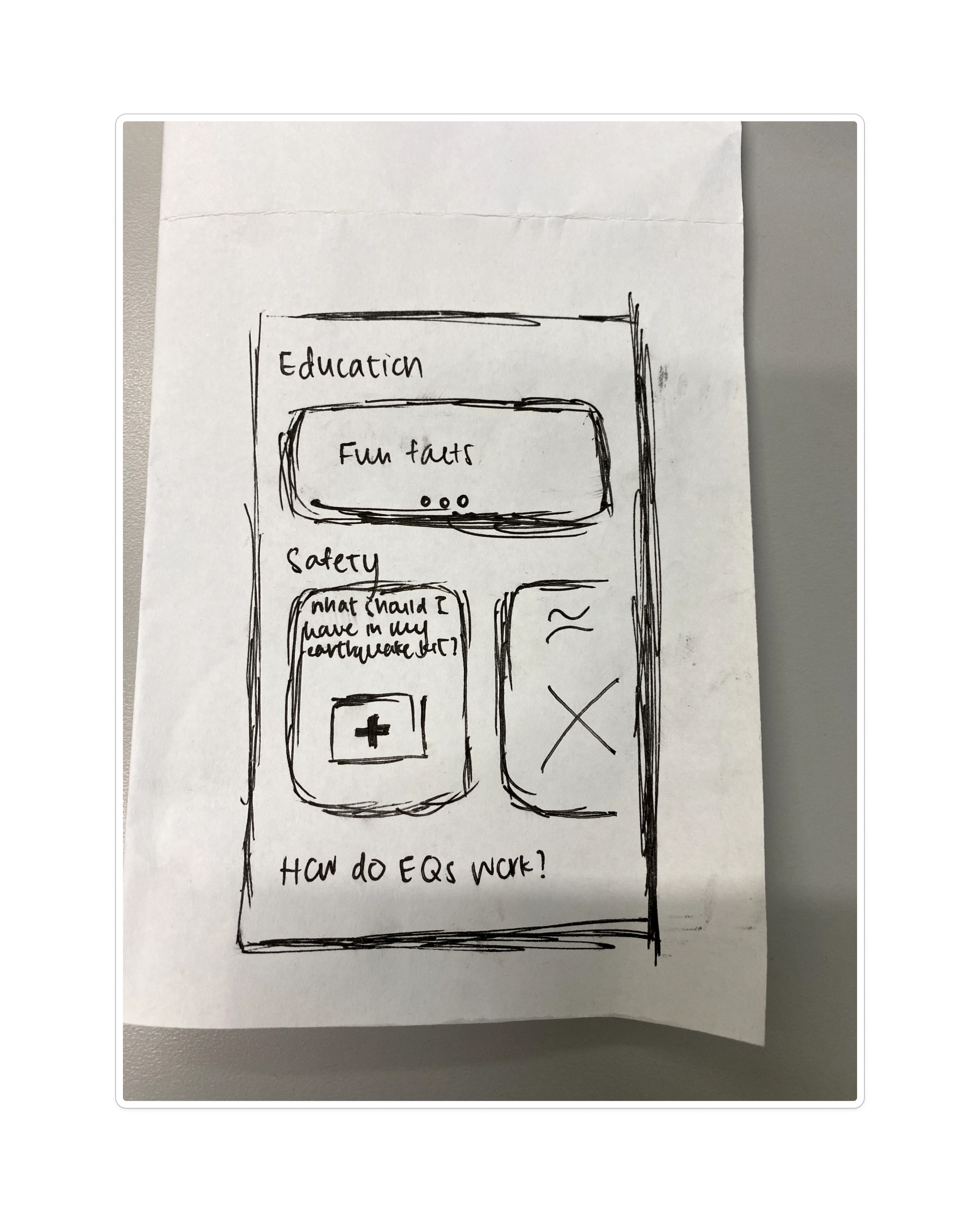
![[interface] screenshot of the software interface (for a productivity tools business)](https://cdn.prod.website-files.com/684b8686903f201509c669f3/6855ed4f43de9ba9869c1765_MyShakesketch2-min.jpg)
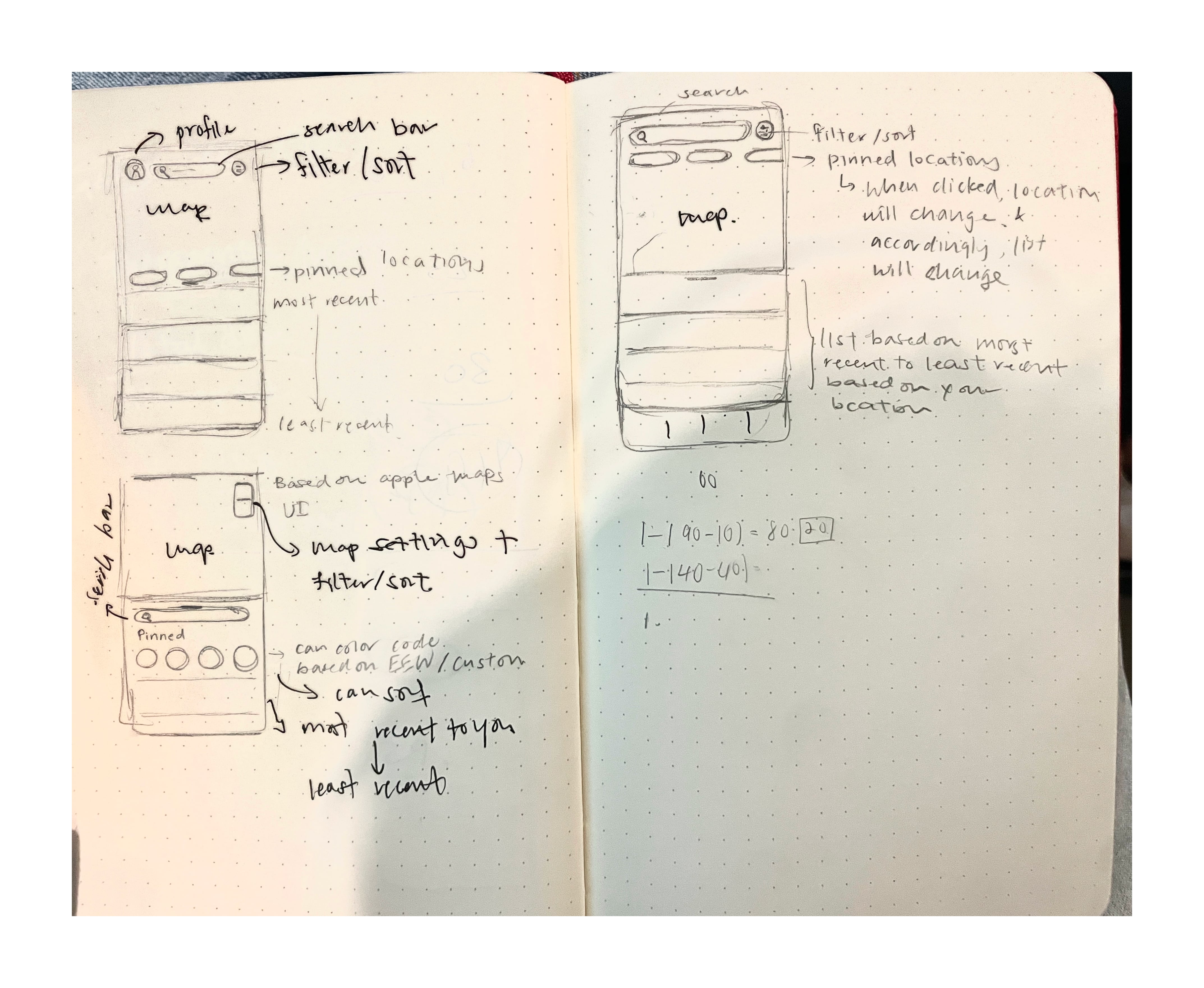
![[digital project] image of digital artwork on a screen (for a graphic design studio)](https://cdn.prod.website-files.com/684b8686903f201509c669f3/68bb7c1c62917a51ad21eec1_MyShake%20UXAB%20Research%20%26%20Sketching.jpg)
![<subject>[interface] image of software interface (for a edtech)</subject>](https://cdn.prod.website-files.com/684b8686903f201509c669f3/68952fbae990f09bc746f7de_Frame%20814.png)
![<subject>[interface] image of a screenshot of a learning module (for a edtech business)</subject>](https://cdn.prod.website-files.com/684b8686903f201509c669f3/686727dec4ab03f18e5f345d_myshake.png)